CSS में Responsive Design सीखें और अपनी website को mobile, tablet और desktop screens पर seamlessly adapt करना सीखें। Viewport, Media Queries और modern layouts की step-by-step guide।
Responsive Design in CSS: हर Device के लिए Perfect Website कैसे बनाएं?
आज के digital era में जब कोई user आपकी website open करता है, तो वह केवल desktop या laptop पर browse नहीं करता। कोई smartphone पर scroll कर रहा होता है, कोई tablet use करता है, तो कोई wide monitor display पर। ऐसे में अगर आपकी website हर screen size और resolution पर properly render नहीं होगी, तो आप अपना valuable user engagement और traffic lose कर देंगे।
इस challenge को master करने के लिए Responsive Design in CSS को गहराई से समझना हर developer के लिए सबसे fundamental requirement है।
Vivaa Technologies के इस comprehensive guide में हम step-by-step समझेंगे कि CSS की core capabilities का use करके एक fully responsive web interface कैसे design और develop किया जाता है। यदि आप full-stack developer या tech student हैं, तो Responsive Design in CSS का practical workflow आपकी frontend toolkit का core foundation बनेगा।
Responsive Design in CSS क्या है?
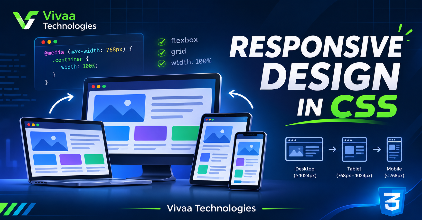
Responsive Design in CSS का core concept यह है कि website का layout automatically user के viewport dimensions, device orientation (portrait या landscape), और screen resolution के हिसाब से dynamically adjust हो जाए।
Responsive Design in CSS implement करने के लिए हम modern CSS specifications जैसे fluid grids, flexible images और media queries का combination use करते हैं।
Step 1: Viewport Meta Tag Configure करें
Responsive Design in CSS का workflow हमेशा HTML document से शुरू होता है। आपको HTML file के <head> element के अंदर standard viewport configuration define करना आवश्यक है। इसके बिना mobile browsers standard desktop view को mimic करते हुए page को zoom-out render कर देते हैं।
अपनी HTML file में यह tag include करें:
HTML
<meta name="viewport" content="width=device-width, initial-scale=1.0">
width=device-width: Browser को instruct करता है कि layout width device की physical screen width से match करे।
initial-scale=1.0: Page load होने पर default zoom level को 1:1 scale पर set करता है।
Step 2: CSS Media Queries का Implementation
Media Queries modern CSS का core engine हैं। Responsive Design in CSS को execute करने के लिए Media Queries developer को specific device conditions या breakpoints के आधार पर conditional styling apply करने की capability देती हैं।
Code implementation देखें:
CSS
/* Base styles - Mobile-First approach */
body {
  background-color: #f8fafc;
  font-size: 14px;
}

/* Tablet breakpoint: 768px viewports */
@media (min-width: 768px) {
  body {
    background-color: #e2e8f0;
    font-size: 16px;
  }
}

/* Desktop breakpoint: 1024px viewports */
@media (min-width: 1024px) {
  body {
    background-color: #ffffff;
    font-size: 18px;
  }
}
यह approach ensure करती है कि styles dynamic breakpoints cross करने पर smoothly switch हो जाएं।
Step 3: Flexbox और CSS Grid Layouts
Legacy web development में layouts build करने के लिए floats और inline-blocks का reliance था, जो fragile साबित होते थे। Modern CSS layout engines Responsive Design in CSS को scalable और clean बनाते हैं।
1. CSS Flexbox (One-Dimensional Engine)
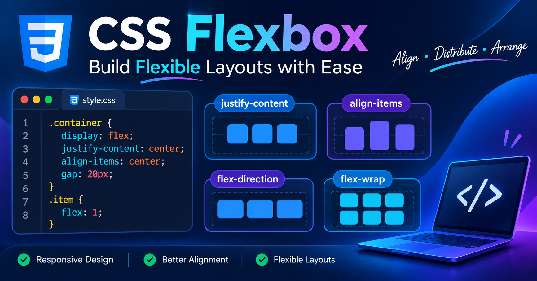
Flexbox rows या columns में single-axis alignment, element distribution और dynamic space allocation के लिए standard method है।
CSS
.container {
  display: flex;
  flex-wrap: wrap; /* Overflow hone par child elements wrap honge */
  justify-content: space-between;
}

.card {
  flex: 1 1 300px; /* flex-grow, flex-shrink, and base width */
}
2. CSS Grid (Two-Dimensional Engine)
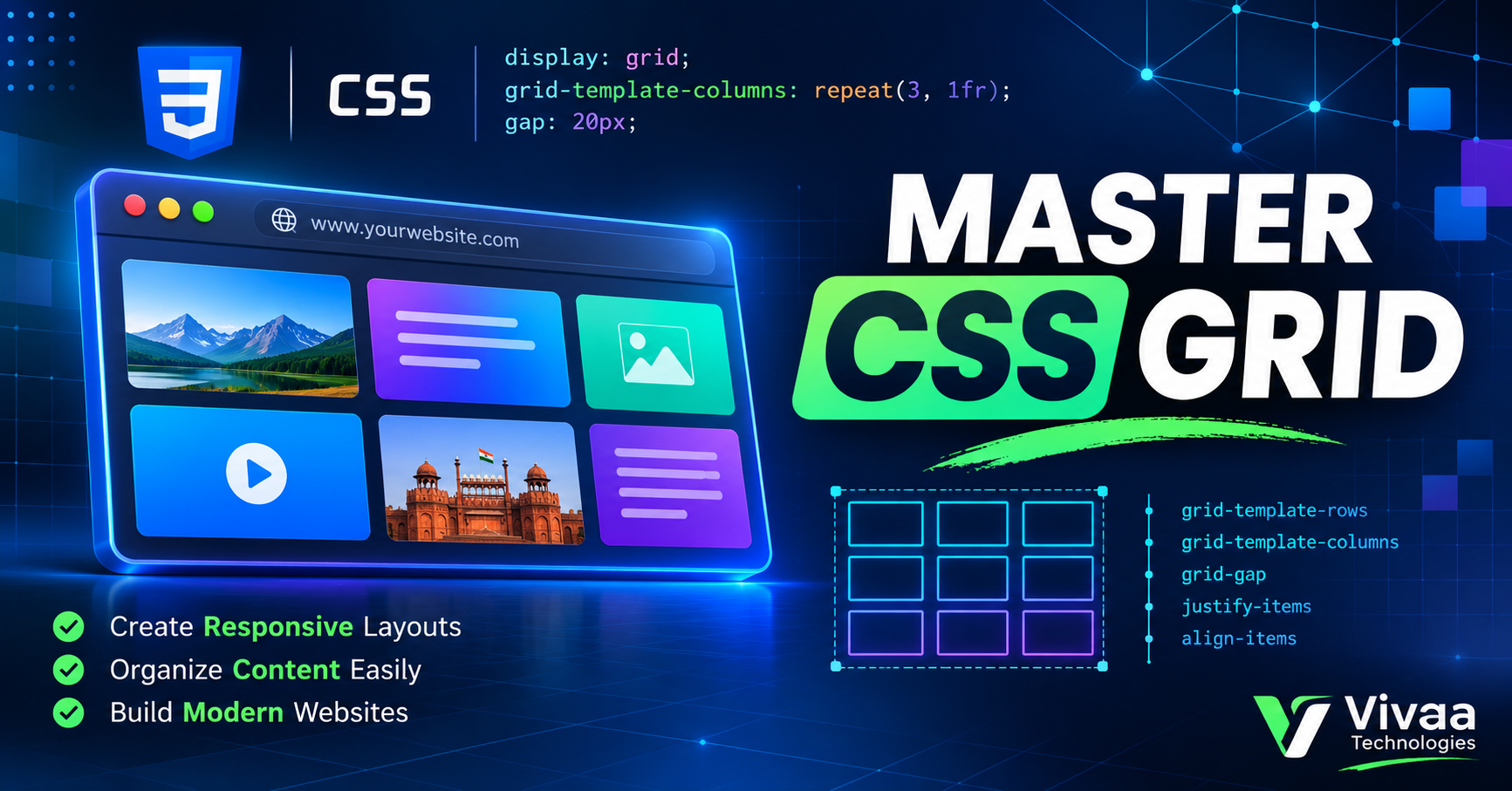
Complex grids, nested layouts और multi-axis management (rows और columns together) के लिए CSS Grid industry-preferred tool है।
CSS
.grid-container {
  display: grid;
  grid-template-columns: repeat(auto-fit, minmax(250px, 1fr));
  gap: 24px;
}
repeat(auto-fit, minmax(250px, 1fr)) का logic बिना explicit media queries के dynamic container-aware responsive grid generate करता है।
Step 4: Fluid Units और Responsive Media Assets
Hardcoded static values जैसे absolute pixels (px) layout adaptability को restrict कर देते हैं। Responsive Design in CSS में fluid web development के लिए relative units prioritize करें:
Container widths के लिए: Percentages (
%) या Viewport Units (vw,vh)Typography, padding और margins के लिए:
remयाem
Image elements को layout bounds से overflow होने से रोकने के लिए global rule set करें:
CSS
img {
  max-width: 100%;
  height: auto;
  display: block;
}
यह browser engine को image aspect ratio maintain करते हुए parent container bounds में scale करने का निर्देश देता है।
Industry Best Practices
Mobile-First Paradigm: Base code हमेशा lightweight mobile viewports के लिए construct करें, फिर progressively advanced screens के लिए
min-widthmedia queries append करें।Device-Agnostic Breakpoints: Specific brand hardware dimensions के बजाए content flow के natural breakage points (standard reference: 480px, 768px, 1024px, 1280px) पर breakpoints define करें।
Browser DevTools Debugging: Chrome DevTools में Responsive Viewport Mode और network throttling profiles enable करके live testing validate करें।
Conclusion
Modern web engineering landscape में Responsive Design in CSS एक optional requirement नहीं, बल्कि baseline standard है। Fluid architecture, modern Flexbox/Grid modules और clean Media Queries architecture implement करके आप high-performance, cross-platform applications create कर सकते हैं।
Continuous coding practice और layout testing frontend proficiency improve करने का fastest way है। Vivaa Technologies industry-oriented full-stack curriculum और tech resources publish करता रहता है। Layout debugging या CSS specifications से जुड़े queries comments section में share करें।